Small retail stores across Indonesia face intense competition from e-commerce platforms and modern shopping centers. While online stores rely on algorithms and convenience, physical retailers have a powerful advantage: the ability to create immediate emotional connections through strategic use of color.
Understanding color psychology can transform your store from just another retail space into a compelling shopping destination that drives customer behavior and increases sales. Research shows that up to 90% of snap judgments about products are based on color alone[1], making your color choices one of the most cost-effective investments you can make in your retail business.
The Science Behind Color and Consumer Behavior
Color psychology isn’t just artistic theory—it’s backed by decades of research into how the human brain processes visual information. When customers enter your store, their brains begin making unconscious associations with the colors they see within the first 90 seconds[1]. These initial impressions influence everything from how long they stay in your store to how much they’re willing to spend. Studies have found that color increases brand recognition by up to 80%[2], which explains why successful retailers carefully plan their color schemes rather than choosing colors randomly.
The relationship between color and purchasing decisions is particularly strong in retail environments. A study published in Management Decision found that consumers make purchasing decisions within 90 seconds of initial interaction with products, and between 62% and 90% of that assessment is based on color alone[1]. For Indonesian retailers competing against the convenience of online shopping, creating the right visual atmosphere can be the difference between a browsing customer and a buying customer.
How Different Colors Influence Shopping Behavior
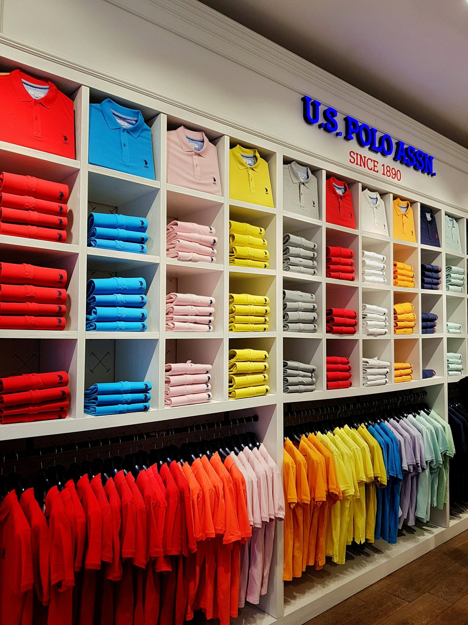
Red: The Urgency Creator
Red is one of the most powerful colors in retail because it creates a sense of urgency and excitement. Research shows that red can increase heart rate and create feelings of urgency, making it highly effective for clearance sales and promotional displays[3]. Major Indonesian retailers use red extensively during discount seasons like Harbolnas (Hari Belanja Online Nasional) and year-end sales. However, red should be used strategically rather than overwhelmingly—too much red can create anxiety rather than excitement. Consider using red for sale signage, call-to-action areas, and promotional displays while keeping primary store colors more neutral.
Blue: Building Trust and Loyalty
Blue is associated with trust, reliability, and calmness, making it ideal for retailers who want to build long-term customer relationships. Banks, pharmacies, and technology stores frequently use blue because it creates feelings of security and competence[4]. Research indicates that blue can actually slow down the heart rate and create a more relaxed shopping environment, encouraging customers to spend more time browsing. For Indonesian retailers selling higher-priced items or products requiring customer trust—such as electronics, health products, or financial services—incorporating blue into your store design can significantly impact purchasing decisions.
Yellow: Attracting Attention and Creating Happiness
Yellow is highly visible and creates feelings of optimism and happiness, making it excellent for attracting attention to specific products or store areas. Studies show that yellow can stimulate mental activity and generate muscle energy[3], which is why fast-food chains and budget retailers use it extensively. However, yellow should be used as an accent color rather than a dominant color, as too much can cause eye fatigue. Indonesian retailers can use yellow for window displays during festive seasons like Lebaran or Chinese New Year to create a cheerful, welcoming atmosphere that draws customers inside.
Green: Promoting Wellness and Sustainability
Green has become increasingly important in retail as consumer awareness about health and environmental issues grows. Associated with nature, health, and tranquility, green is ideal for stores selling organic products, wellness items, or eco-friendly goods[4]. Research shows that green can be particularly effective in relaxation spaces within stores, such as fitting rooms or waiting areas. With Indonesian consumers becoming more environmentally conscious, incorporating green into your retail design—especially if you offer sustainable or natural products—can strengthen your brand positioning and attract environmentally-minded shoppers.
Black and White: Sophistication and Simplicity
Black conveys luxury, sophistication, and exclusivity, making it a favorite among high-end retailers and fashion boutiques. White represents simplicity, cleanliness, and modernity, which is why Apple stores and minimalist brands use it extensively[2]. The combination of black and white creates strong contrast that makes products stand out and can elevate perceived value. Indonesian retailers selling premium products or targeting urban, design-conscious consumers should consider incorporating these colors to communicate quality and sophistication.
Applying Color Psychology to Indonesian Retail Spaces
Understanding Cultural Color Associations
While color psychology has universal elements, cultural context matters significantly. In Indonesia, certain colors carry specific cultural meanings that retailers should consider. Red and gold are associated with prosperity and good fortune, particularly important during Chinese New Year celebrations. White, while representing purity in Western contexts, can be associated with mourning in some Indonesian cultures[5]. Green holds special significance as the color of Islam, Indonesia’s majority religion. Successful Indonesian retailers combine universal color psychology principles with local cultural understanding to create environments that resonate with their specific customer base.
Color Strategies for Different Product Categories
Different product types benefit from different color schemes. Food retailers should emphasize warm colors like red, orange, and yellow, which are known to stimulate appetite[3]. A study in the Journal of Food Quality and Preference found that warm colors can increase perceived tastiness of food products. Fashion retailers benefit from black, white, and neutral tones that let clothing colors stand out while communicating style and sophistication. Electronics and technology stores perform well with blue and silver tones that suggest innovation and reliability. Indonesian grocery stores and traditional markets have long understood this instinctively, using warm lighting and colorful displays to make fresh produce more appealing.
Creating Color Zones Within Your Store
Strategic color zoning can guide customer flow and influence purchasing behavior throughout your store. Research on retail environments suggests that stores should use warmer, more stimulating colors near the entrance to attract customers inside, then transition to cooler, more relaxing colors deeper in the store where customers make purchasing decisions[4]. This technique, called color sequencing, can increase the time customers spend in your store by up to 15%. For Indonesian retailers working with limited space, creating distinct color zones for different product categories helps customers navigate your store while maintaining visual interest.
Practical Implementation Tips for Small Indonesian Retailers
Start with Strategic Accent Walls
You don’t need to repaint your entire store to harness color psychology. Begin with strategic accent walls in key areas—behind checkout counters, in window displays, or highlighting featured product sections. A study by the Pantone Color Institute found that accent colors can influence purchasing decisions as effectively as whole-store color schemes when placed strategically[2]. This approach is particularly budget-friendly for small Indonesian retailers who want to test color strategies before committing to larger renovations.
Use Lighting to Enhance Color Impact
Color appearance changes dramatically under different lighting conditions, a principle called metamerism. Warm lighting (2700-3000K) enhances reds, oranges, and yellows, making products appear more inviting and comfortable—ideal for clothing and home goods. Cool lighting (4000-5000K) enhances blues and greens, creating a clean, modern atmosphere better suited for electronics and professional services[3]. Indonesian retailers often overlook lighting as a color tool, but investing in appropriate lighting can multiply the effectiveness of your color choices without requiring structural changes.
Test and Measure Your Color Choices
Successful retailers treat color selection as an ongoing experiment rather than a one-time decision. Consider A/B testing different color schemes in window displays or promotional areas and tracking which versions drive more foot traffic or sales. A retail study found that stores that regularly refresh their color schemes see an average 20% increase in customer engagement compared to those with static designs[4]. For Indonesian retailers, this might mean rotating colors seasonally or aligning with local festivals and celebrations to keep your store feeling fresh and relevant.
Coordinate with Your Product Packaging
Color consistency between your retail environment and product packaging creates a cohesive brand experience that builds recognition and trust. Research shows that color consistency across touchpoints can increase brand recognition by up to 80%[2]. If your products feature specific brand colors, incorporate these into your store design—but use them strategically rather than overwhelming customers. Indonesian retailers selling both branded products and generic items should create neutral background colors that let product packaging colors shine while maintaining an organized, professional appearance.
Common Color Psychology Mistakes to Avoid
Overusing High-Energy Colors
While red and orange drive urgency and excitement, using them excessively creates visual fatigue and anxiety. A study in the Journal of Retailing found that stores with predominantly high-energy color schemes saw customers leaving 30% faster than stores with balanced color palettes[3]. Indonesian retailers sometimes make this mistake during promotional periods, covering every surface with bright red sale signs. Instead, use high-energy colors strategically for specific calls-to-action while maintaining calmer base colors.
Ignoring Color Accessibility
Approximately 8% of men and 0.5% of women have some form of color vision deficiency[5], meaning roughly 3-4 million Indonesians experience difficulty distinguishing certain colors. Relying solely on color to convey important information—such as using only red for sale items without additional signage—excludes these customers. Ensure important information uses both color and text or symbols to be accessible to all shoppers.
Following Trends Over Strategy
Color trends change regularly, but your retail color scheme should align with your brand positioning and customer expectations rather than fleeting trends. A store that constantly changes its color scheme appears unstable and confuses customers. Research indicates that it takes 5-7 brand impressions for consumers to remember a brand[2], and frequently changing colors resets this counter. While Indonesian retailers should refresh displays seasonally, maintain core brand colors consistently to build recognition.
Measuring the Impact of Color Changes
Track Key Performance Indicators
After implementing color psychology strategies, monitor specific metrics to measure effectiveness. Track average transaction value, time spent in store, conversion rate (percentage of visitors who make purchases), and customer return frequency. A retail analytics study found that stores implementing strategic color changes saw an average 15% increase in conversion rates over six months[4]. Indonesian retailers can use simple methods like counting customers entering versus purchasing, or noting which colored display areas generate the most attention.
Gather Customer Feedback
Direct customer feedback provides qualitative insights that numbers alone cannot capture. Ask customers what they notice about your store environment or which areas they find most appealing. Indonesian customers often appreciate being asked for their opinions, and this engagement can build loyalty while providing valuable information. Consider informal surveys or simply conversing with regular customers about their shopping experience and any changes they’ve noticed.
Compare Seasonal Performance
Indonesian retail follows distinct seasonal patterns aligned with Ramadan, Lebaran, Chinese New Year, Christmas, and year-end holidays. By adjusting colors strategically for these periods and comparing year-over-year performance, you can identify which color strategies work best for your specific customer base during different seasons. Document what works so you can refine and improve your approach each year.
Transform Your Retail Space with Professional Visual Merchandising
Implementing color psychology effectively requires more than just painting walls—it demands strategic planning, understanding of lighting, coordination with signage and displays, and consistent execution across all customer touchpoints. While this article provides the foundational knowledge needed to begin applying color psychology in your store, professional visual merchandising services can help you implement these strategies with precision and measure their impact on your bottom line.
MD Asia specializes in creating comprehensive visual merchandising solutions tailored for Indonesian retailers. Our integrated approach combines color psychology research with practical understanding of local consumer behavior, cultural preferences, and retail best practices. From initial color strategy development through implementation and performance tracking, we provide end-to-end solutions that transform your retail space into a sales-driving environment. Contact MD Asia today to discover how strategic color choices can increase your store’s sales and create memorable shopping experiences that keep customers returning.
👉 Contact us today and start creating a store display that truly stands out.
References
- https://www.colorcom.com/research/why-color-matters
- https://www.rebootonline.com/blog/color-psychology-in-marketing/
- https://www.verywellmind.com/color-psychology-2795824
- https://www.shopify.com/retail/psychology-of-color-retail
- https://www.colourblindawareness.org/colour-blindness/